Engineered Interruption: The Hidden Architecture Behind Every Alert That Derails Your Day
At some point between the era of the blinking cursor and the present moment, the notification stopped being a message and became a demand. What began as a utilitarian signal — a flag raised to indicate something genuinely requiring attention — has been methodically redesigned into one of the most effective attention-extraction systems ever embedded into consumer software. The modern notification is not a courtesy. It is an architecture.
Understanding how that architecture was built, and why it persists, requires looking past the surface-level annoyance most users accept as an unavoidable feature of digital life.
From Signal to Stimulus
Early operating systems treated notifications with restraint. A system alert meant something had changed that the user needed to know about — a completed process, a critical error, an incoming message from another person. The signal carried weight precisely because it was rare.
The transition away from that model was not accidental. As mobile platforms matured in the late 2000s and early 2010s, app developers and platform engineers recognized that notifications were one of the few mechanisms capable of pulling a user back into an application after they had voluntarily left it. Apple's introduction of push notification infrastructure in 2009 formalized what would become a commercial imperative: the ability to reach users regardless of whether they had chosen to engage.
What followed was an escalation. Each application competed for attention within an increasingly crowded notification environment, and the logical response to diminishing returns was not restraint — it was amplification. Badges multiplied. Banners grew more insistent. Sound profiles were tuned to trigger the same neurological responses that make a ringing phone impossible to ignore. The notification was no longer a signal. It had become a stimulus.
The False Urgency Economy
Perhaps the most consequential design decision embedded in modern notification systems is the normalization of artificial urgency. Users in the United States receive, on average, dozens of push notifications per day across their devices. A significant portion of these carry language or visual framing that implies time-sensitivity: limited-time offers, unread counts displayed as mounting obligations, red badge numbers that grow with each passing hour.
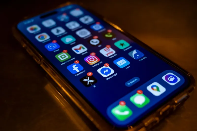
The red badge deserves particular scrutiny. Originally adopted to indicate messages requiring a response, the badge numeral has been co-opted across application categories that have no legitimate claim to urgency. A social media application displaying 47 unread items is not communicating that 47 things require the user's attention. It is communicating that 47 interactions occurred in the user's absence — and framing that absence as a deficit to be corrected.
This is a manufactured obligation. The user did not fall behind. The system decided to frame normal, asynchronous activity as an accumulating debt, and the interface design enforces that framing at every glance.
Interruption Has a Measurable Cost
The productivity literature on interruption is extensive and consistent. Research from institutions including the University of California, Irvine has documented that recovering full cognitive focus after an interruption takes, on average, more than twenty minutes. When interruptions arrive in clusters — as notification systems are now designed to deliver them — the recovery window never fully closes. The user operates in a state of perpetual partial attention, never quite immersed in any single task.
Operating system vendors have acknowledged this cost, at least superficially. Apple's Focus modes and Microsoft's Do Not Disturb functionality represent genuine attempts to give users structural tools for managing interruption. Android's notification channels allow application-level granularity. These are meaningful features. They are also, notably, opt-in — meaning the default state of every new device is maximum interruption, and the burden of configuration falls entirely on the user.
The asymmetry here is worth naming plainly. Application developers invest engineering resources into making their notifications more compelling, more persistent, and harder to dismiss. Platform vendors provide tools that allow users to manually counteract those investments. The contest is not balanced.
The Permission Theater
Both iOS and Android now require applications to request explicit permission before delivering notifications. This is framed as user empowerment, and in a narrow technical sense, it is. Users can decline. In practice, however, the permission request arrives at the moment of highest engagement — immediately after a user has downloaded an application and is most invested in its value proposition. Declining notification permission at that moment feels like self-sabotage.
Application developers understand this dynamic. Onboarding flows are engineered to present the notification permission request after delivering a taste of the application's core value, maximizing the psychological likelihood of approval. The permission prompt is real. The conditions under which it is presented are carefully managed.
This is not a critique unique to notifications — it echoes broader patterns in how platform permission systems operate. But the notification case is particularly stark because the permission being granted is, functionally, permission to interrupt. Users are consenting to a relationship whose full implications — the cumulative cognitive cost, the manufactured urgency, the behavioral conditioning — are not disclosed in the prompt.
Why Systems Claim to Help While Doing Otherwise
The language surrounding notifications is almost uniformly framed around user benefit. Applications promise to keep users informed, connected, and on top of things. Operating system documentation describes notification systems as tools for staying organized. The framing is consistent because it is commercially necessary — no application can openly admit that its notification strategy is designed to maximize re-engagement metrics rather than user welfare.
But the infrastructure tells a different story. Notification analytics platforms, widely used by application developers, track open rates, conversion rates from notification to in-app action, and optimal delivery timing based on individual user behavior patterns. These are engagement metrics. They measure what the notification accomplished for the developer, not what it provided to the user.
A notification system genuinely designed around user benefit would optimize for different variables: relevance accuracy, interruption frequency relative to user-defined priorities, and long-term cognitive load. Some research-oriented projects have explored these dimensions. Mainstream commercial platforms have not prioritized them.
The Recalibration Users Deserve
None of this is to suggest that notifications are inherently harmful or that platform vendors have acted in bad faith. Genuine utility exists in the model. A navigation application alerting a driver to a sudden road closure is performing exactly the function notifications were designed for. A medical application surfacing a critical health reminder is providing real value. The mechanism itself is not the problem.
The problem is the systematic exploitation of that mechanism across contexts where urgency is manufactured, attention is extracted, and the user's cognitive resources are treated as a renewable commodity available for commercial harvest.
The recalibration that would genuinely serve users would require platform vendors to make restraint the default rather than the exception — to ship devices in states that protect attention rather than monetize it, and to hold application developers to standards that distinguish legitimate alerting from behavioral manipulation.
Until that recalibration occurs, the notification will remain what it has quietly become: not a tool users control, but a lever that controls them.